MOWI Consumer


Overview
MOWI brings salmon and other seafood to consumers in over 70 countries.
The company has a global footprint, with operations represented in 25 countries and activities spanning feed, farming, and sales & marketing.
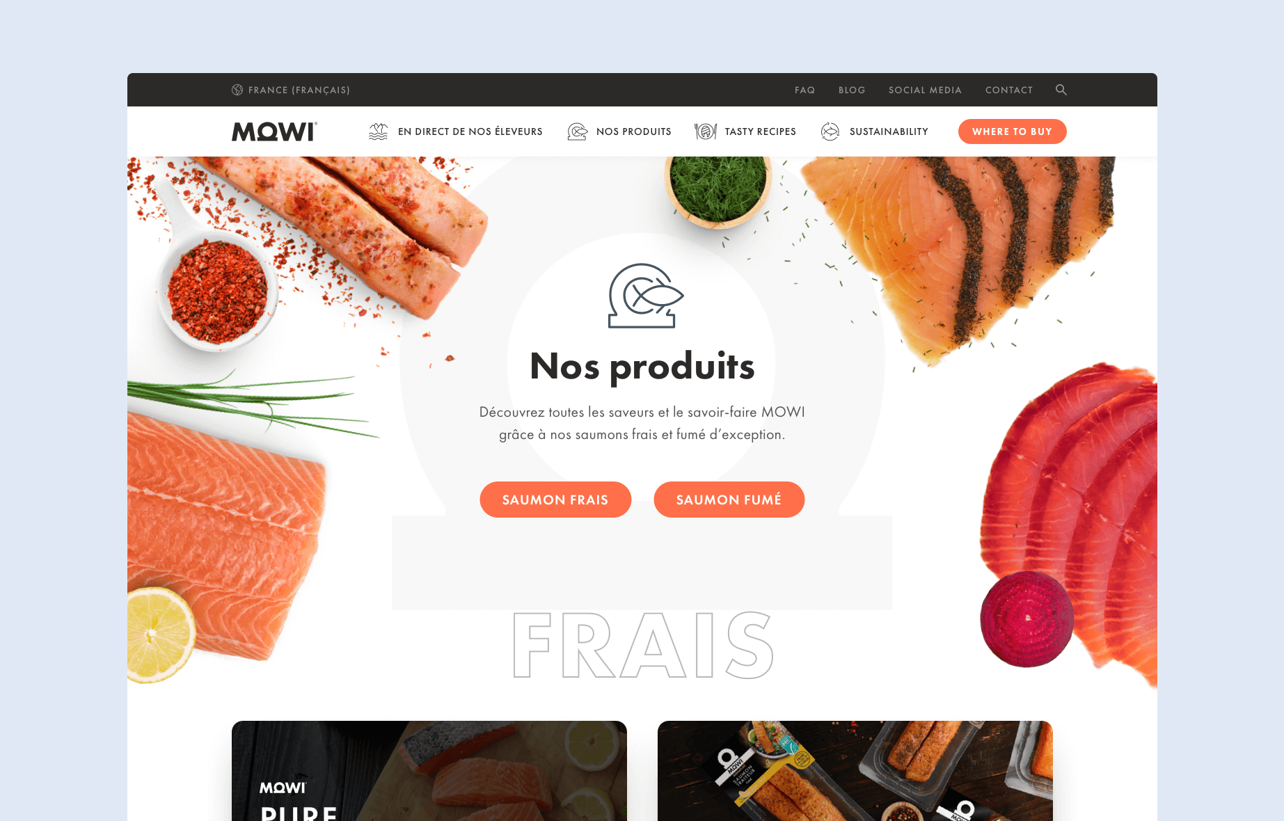
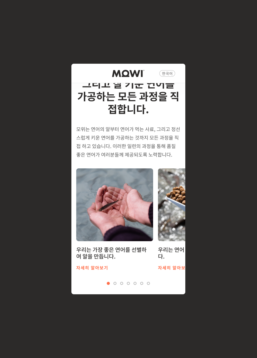
For consumer-facing design, that scale calls for a website experience that stays consistent across markets while remaining clear, approachable, and easy to use on any device.

Context
A framework needed to support discovery, purchase intent, and repeat visits across 10 consumer markets without diverging.
The consumer website needed a scalable structure that supports discovery, purchase intent, and post-purchase moments. For many visitors, the site is where they first learn what a product is, what to expect, and where to find it. After purchase, people come back for practical content that supports everyday use, such as simple guidance, recipes, and product-related information that feels easy to access.
Across a global rollout, the experience also needed shared patterns and guardrails so new market sites could launch without diverging in navigation, content hierarchy, or visual language. This meant the framework had to work as a lasting foundation, not a one-off design, so future market sites could build on it without renegotiating structure each time.
To make the work easier to align on across teams and markets, I first mapped the key paths through the website and the way content needed to be organized. The diagrams captured the structure used to guide page hierarchy, navigation decisions, and the main journeys people take from discovery to action.



Outcome
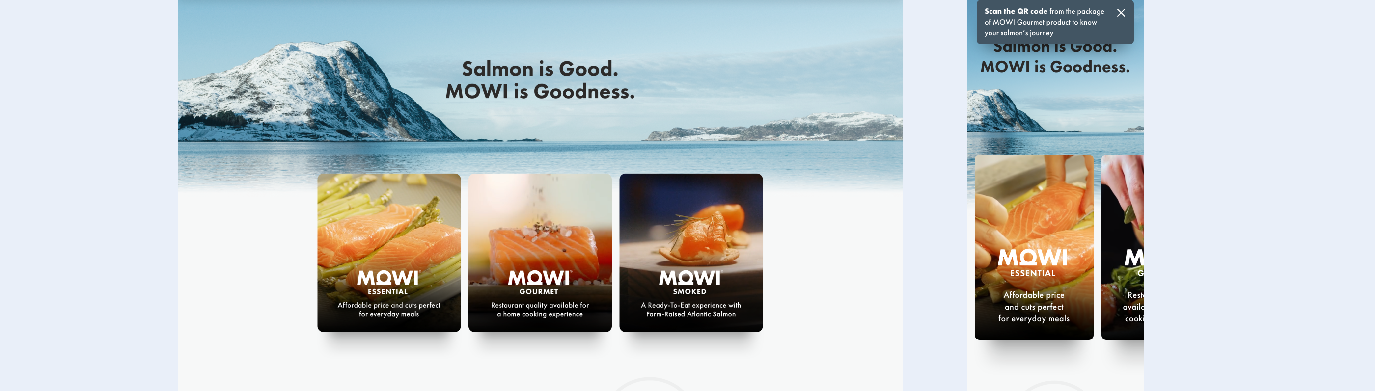
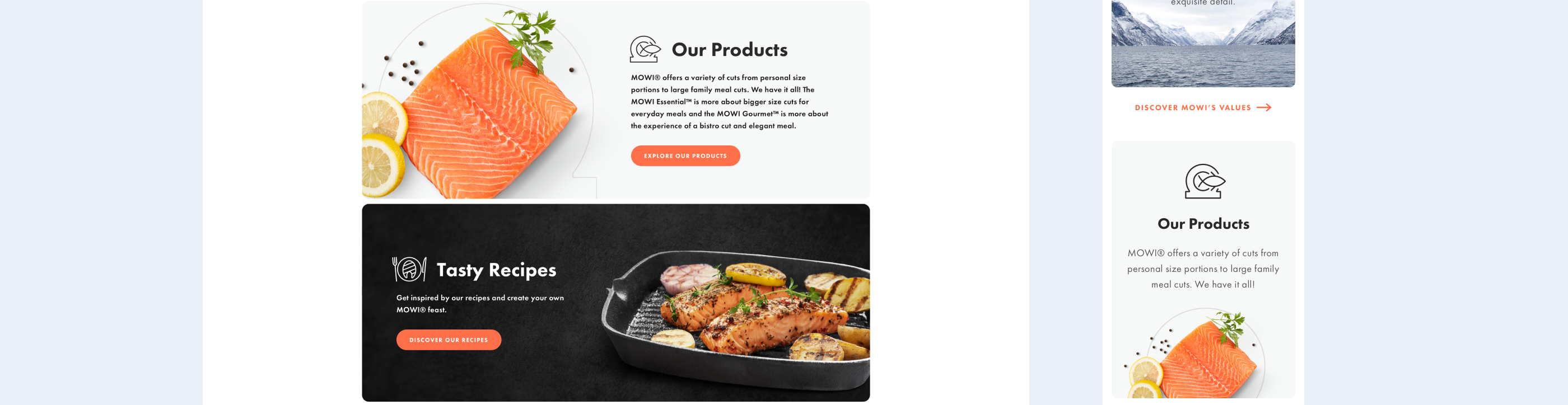
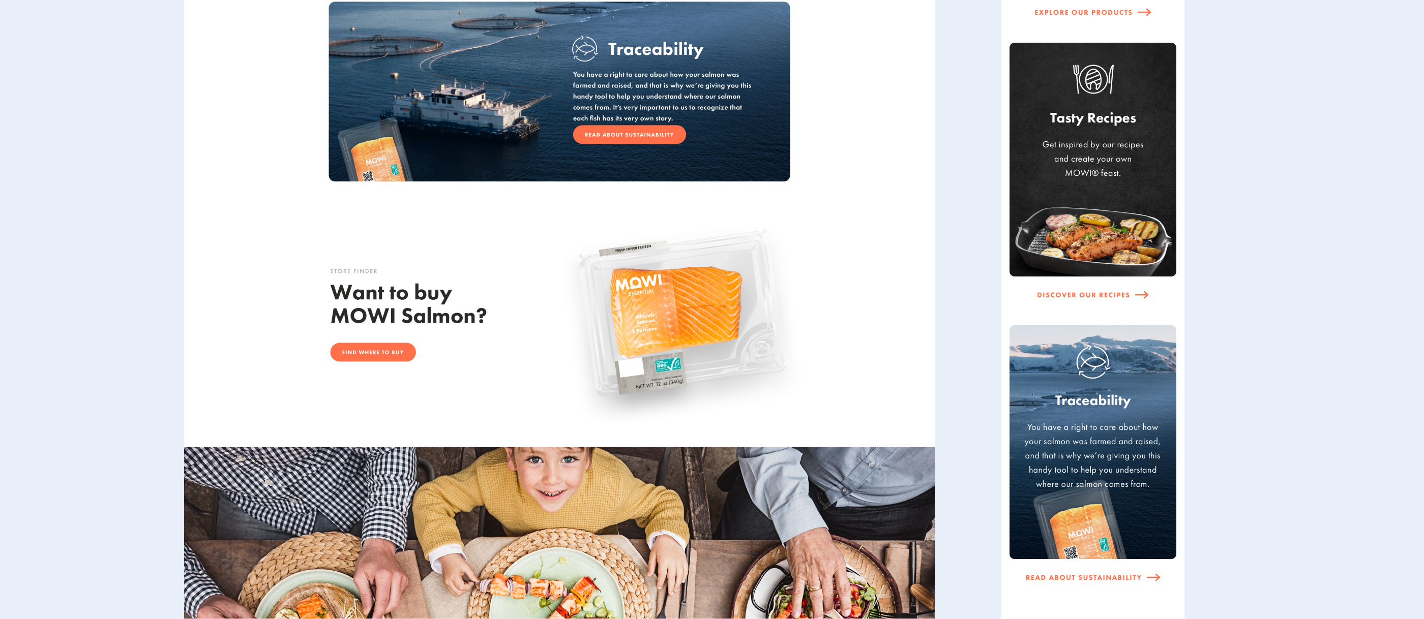
A consistent set of consumer website patterns was created to support global rollouts while keeping the experience clear and recognizably MOWI.
After implementation, the new site structure contributed to a reduction in abandonment rate, an increase in pages visited per session, and an increase in sessions per user.
The resulting foundation improved how users move through key tasks such as browsing product information and finding where to buy, while supporting repeat visits with helpful post-purchase content. To make the transition feel safe and predictable, I added lightweight first-time guidance so users understood what changed without slowing them down.
I was the sole designer on this project at mohi.to agency, working closely with MOWI's Global and Regional Marketing Teams.