Eurocash360
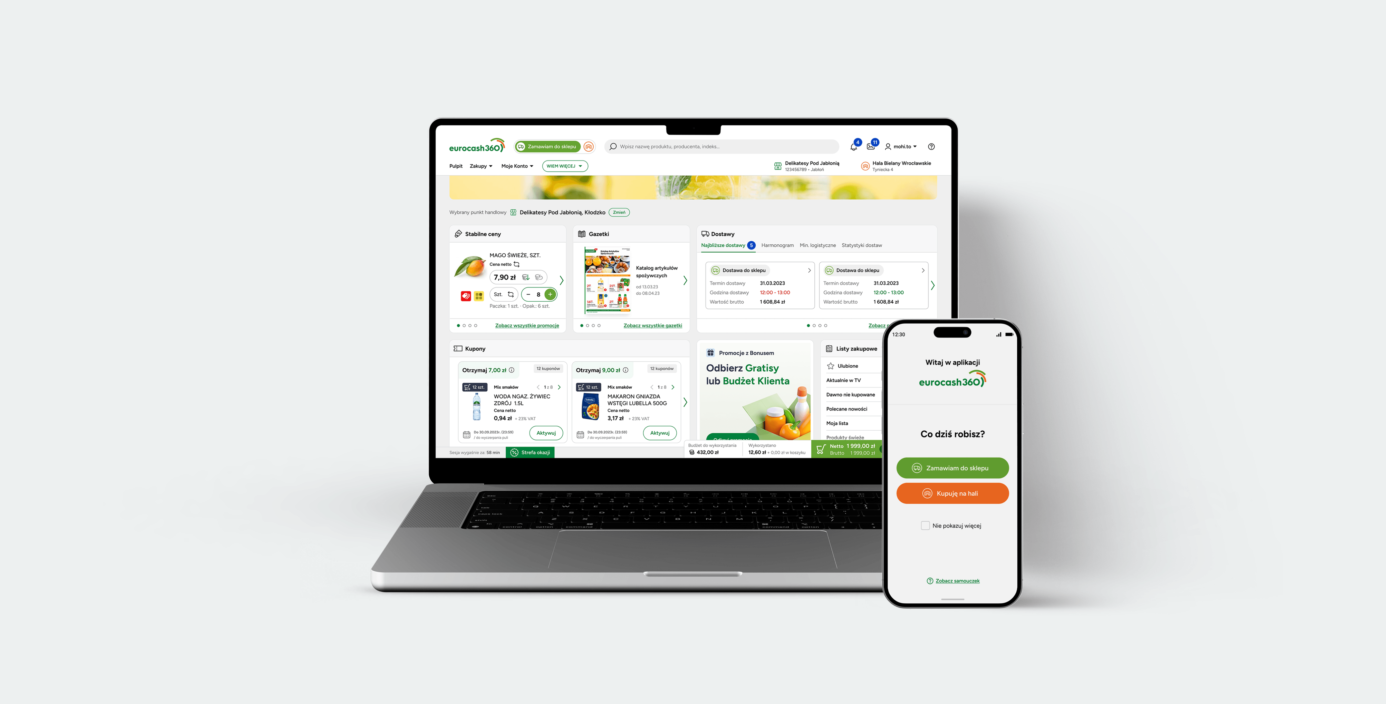
Overview
Eurocash Group is the largest wholesale distributor of fast-moving consumer goods (FMCG) in Poland.
They provide comprehensive supply chain solutions, keeping thousands of independent grocery stores, cafes, restaurants, and hotels stocked and running smoothly.
Context
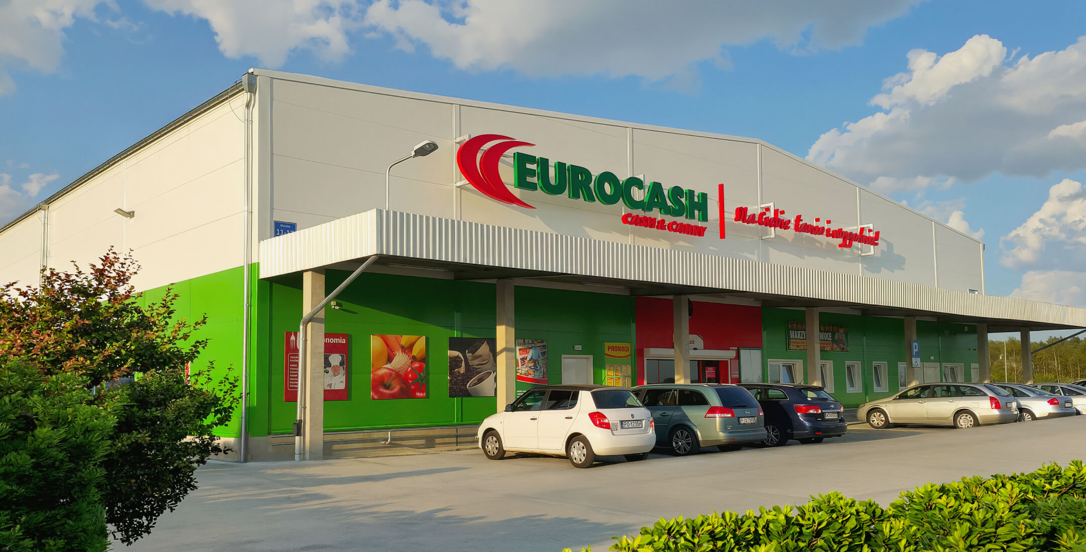
Eurocash operated two disconnected apps for deliveries and in-person shopping, creating a fragmented digital experience that needed to be unified.
Previously the company ran entirely separate applications: one for ordering deliveries, another for the Cash & Carry halls. Different databases. Different navigation logic. Different pricing, too. A customer could see one price on the delivery app and something else entirely at the hall, with no way to compare or switch between the two.
This fragmentation was one piece of a multi-year transformation of Eurocash's wholesale business, part of modernizing how the company served independent store owners at scale.
A key discovery insight shaping every design decision was the target audience: the largest user group is 50+, many of them long-time store owners more used to in-person, paper-based, or phone-based ordering than digital tools. Accessibility, low cognitive load, and forgiving interaction patterns had to come before trend-driven UI choices.
The goal was a single product spanning web, desktop, and native iOS/Android apps, one that could hold two very different purchasing logics without either one losing its clarity — while respecting how differently a store owner uses a phone in the middle of the hall versus a desktop at the back office.
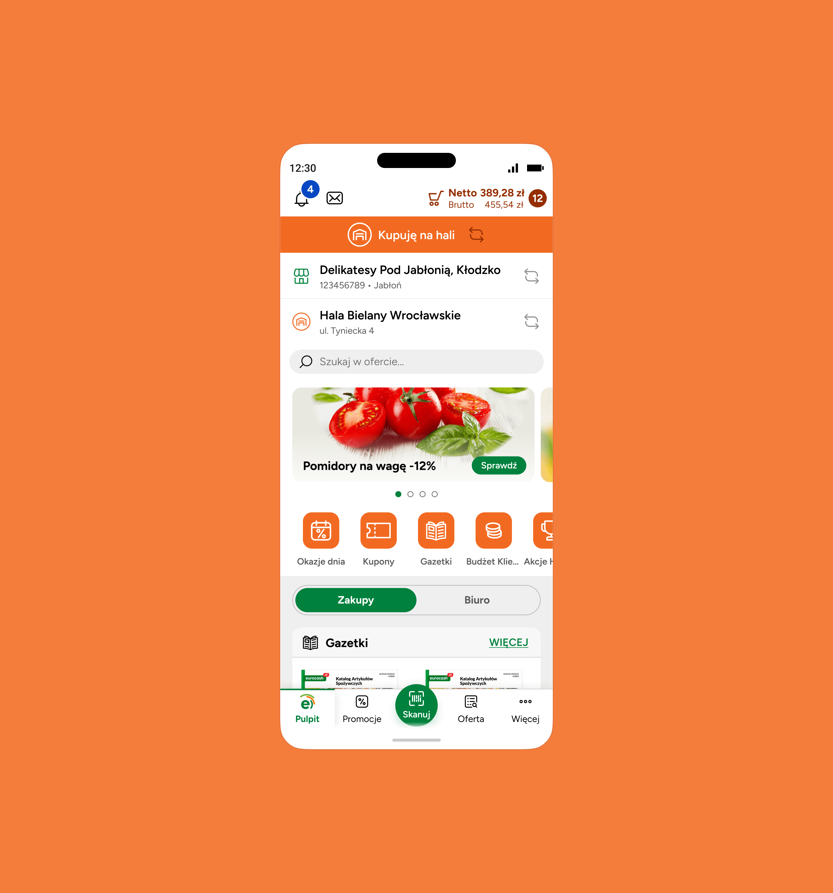
Team & my role
The project was designed by a 4-person team at mohi.to agency. As the core contributor, I carried most of the design work, from information architecture through to final UI.
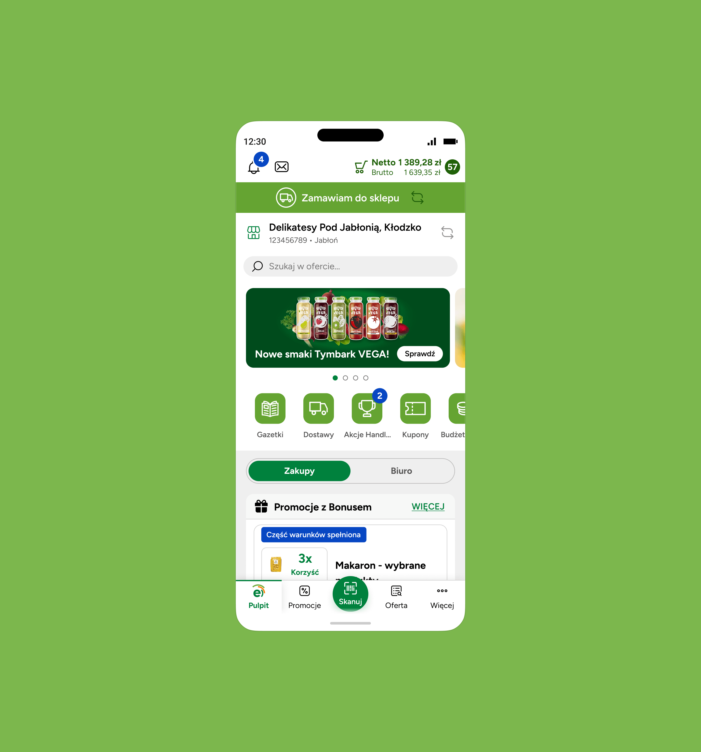
I designed the overall structure, navigation logic, and interaction patterns running across native iOS, Android, and web/desktop — adapting flows to each platform's conventions (e.g. gesture-based cart management and barcode scanning on mobile vs. denser data views on desktop) while keeping the underlying design system consistent. I owned the most critical part of the product, the offer/catalog screen, adapted for both native mobile and web contexts, and I was responsible for the advanced cart system (covered below).
We worked in an agile setup, running two-week sprints in close cross-functional collaboration with Eurocash's product and dev teams through discovery, wireframing, and developer handoff.
Eurocash ran usability testing with real users and, while we were working, kept bringing results back to us. That loop mattered: our design decisions got validated against actual user behavior. That shaped things like the promotion completion mechanic and the multi-cart flow.
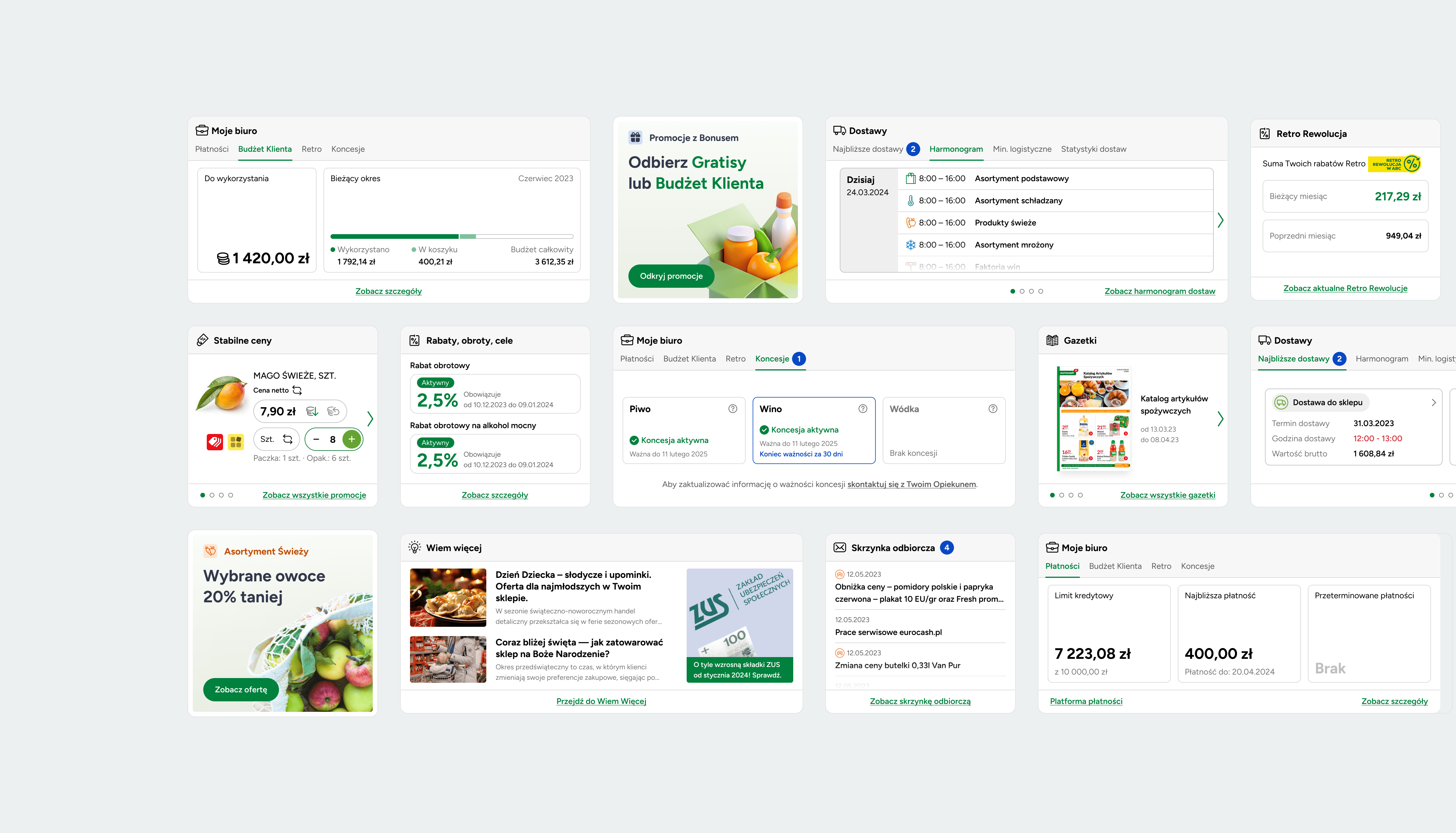
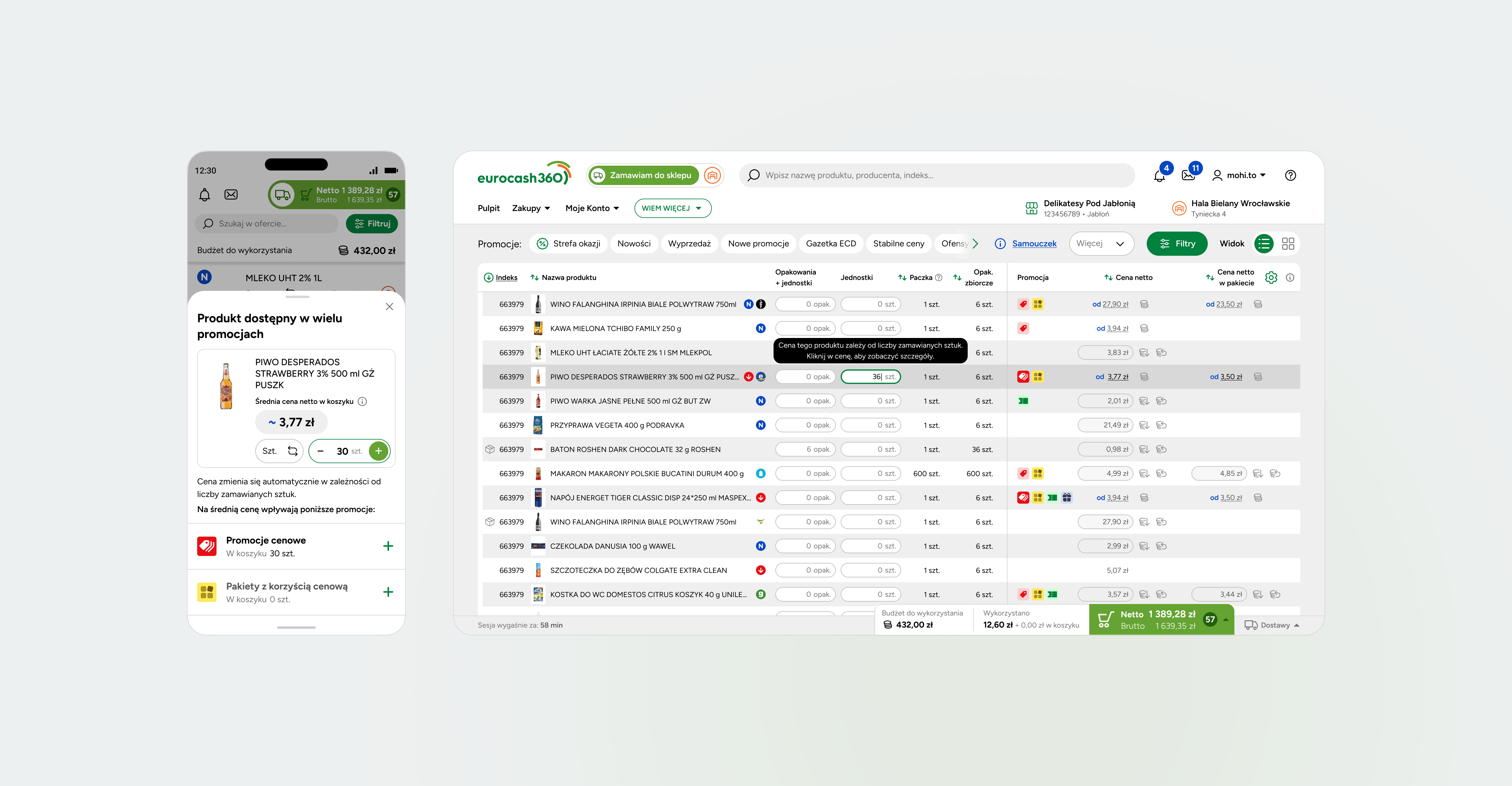
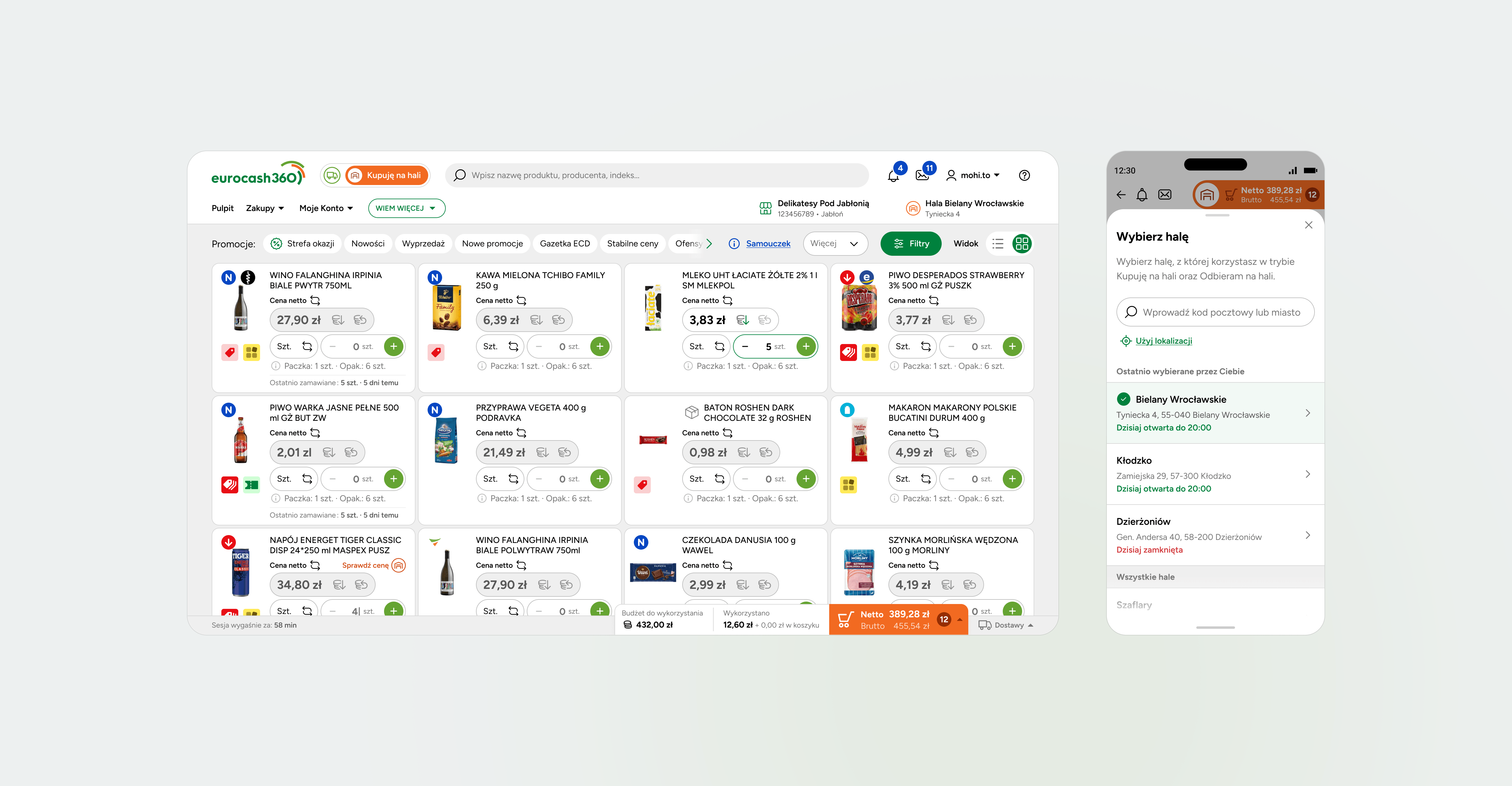
Approach
Every decision in this section came down to one thing, really: making two conflicting shopping logics feel like a single system.
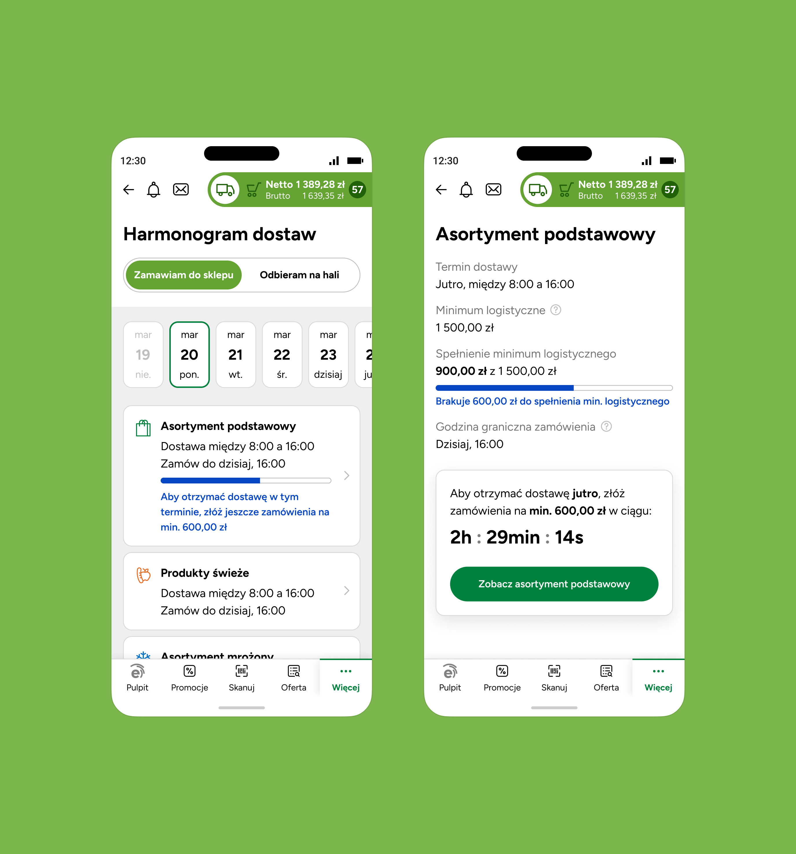
Starting from Eurocash's user research and the MVP scope, we leaned on Analytics and Hotjar data to shape an information architecture built around what each customer group actually needed. The toughest system-level problem was reconciling two channels running on completely different pricing and purchasing logic, Cash & Carry halls on one side, scheduled deliveries on the other, into something that felt like one coherent product.
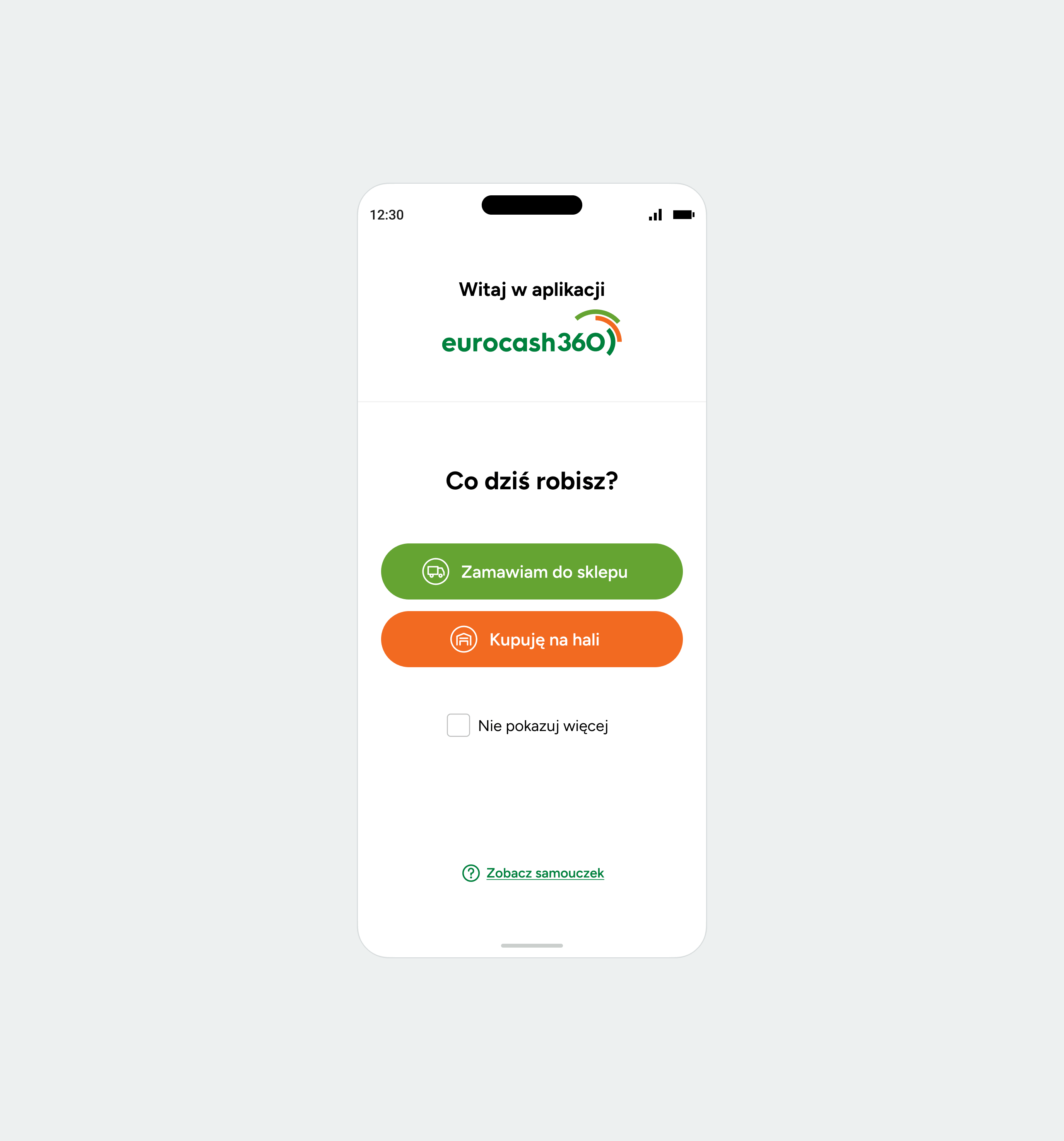
To avoid making users mentally switch between modes, I designed a shared Customer Budget, a real-time price comparison view, and a persistent indicator that always showed which channel someone was currently shopping in. Without that constant, visible anchor, it would've been easy to lose track of which prices or promotions applied at any given moment, especially for users who weren't used to context-switching inside an app in the first place.

The cart as a system
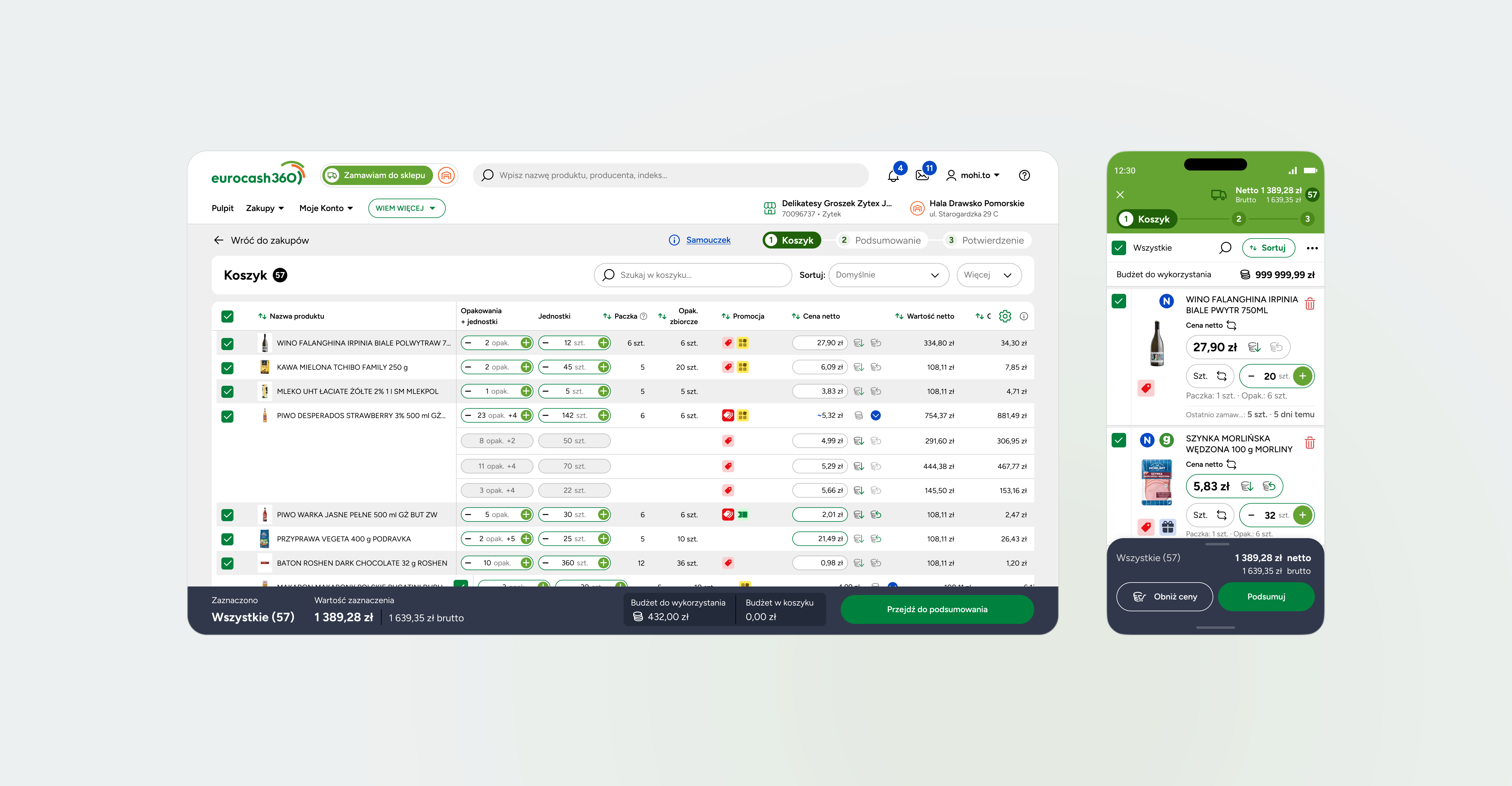
For many Eurocash customers, the cart isn't a checkout step, it's storage, a promotion tracker, and a running list of several prices at once.
For delivery orders, I built a cart that lets customers select and deselect individual items for partial submission, because these orders often get placed over days, not minutes, and fulfilled in batches rather than one clean transaction.
Then there's the promotion completion piece. If a customer is short by — for example — 2 units on a promotion requirement, the cart lets them top it up to unlock the discount. The same item could sit inside two or three different offers simultaneously, and some promotions only kick in at certain quantity tiers, meaning a single product line in the cart might carry several prices at once, not just one.
Because of this, I designed an aggregate promotions view showing every deal a product currently qualifies for, presenting a clean average price per product while keeping the full breakdown available for anyone who wanted to dig into it — so customers could trust the total on screen without doing math in their head. Post-launch, promotion utilization increased meaningfully, contributing to a measurable lift in average order value.
Self service in the hall
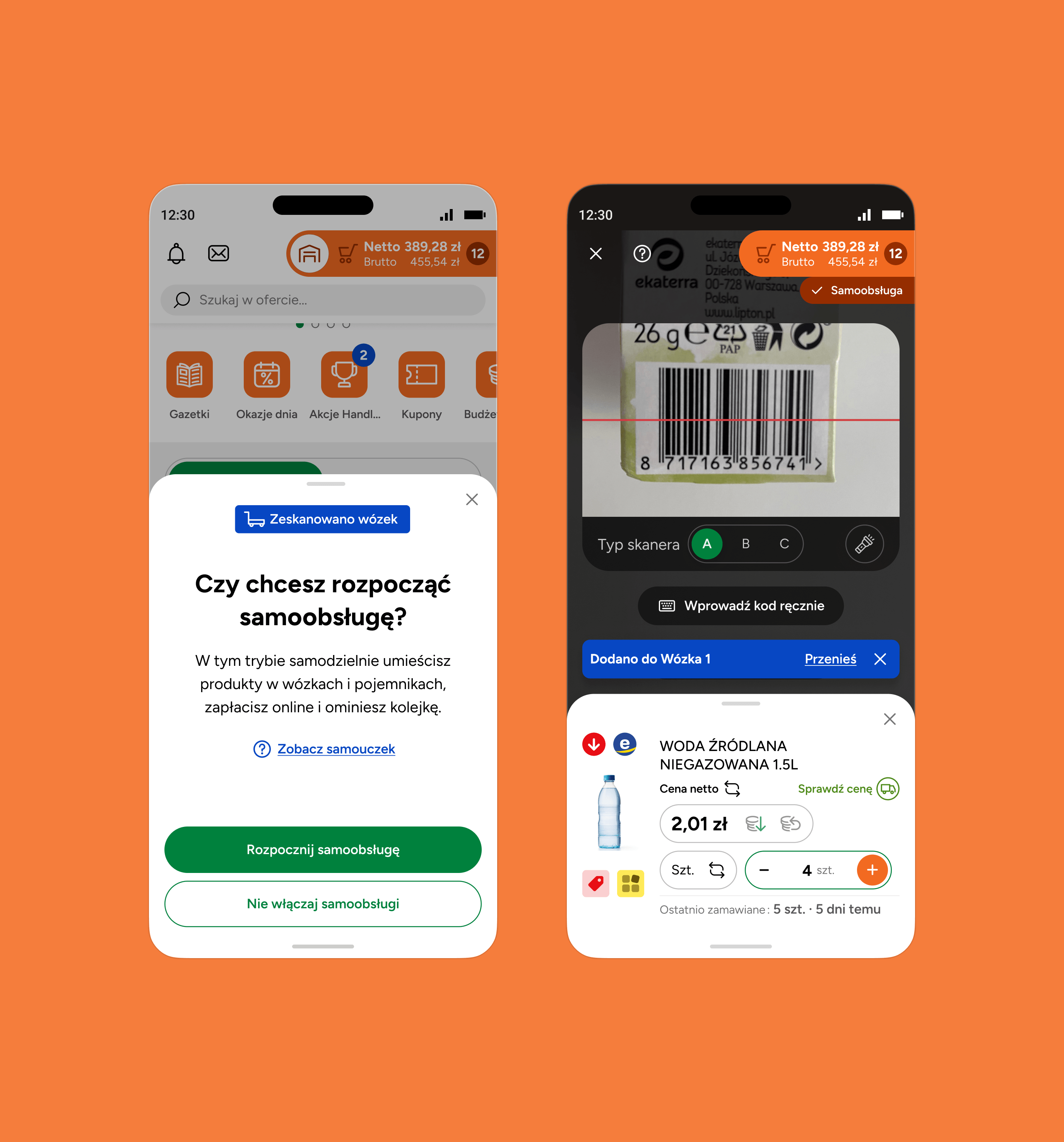
Customers scan their own cart in the hall, manage several at once, add containers, deposits, and bundle deals, all in one place.
This flow only exists on the native mobile app, since it depends on the phone's camera for scanning and needs to work reliably with one hand while someone's pushing a cart. For in-hall shopping, I designed the self-service flow: scan a barcode on your physical cart to link it to a digital session, then scan and add products yourself as you go. Customers can run several physical carts at once within a single app session, adding, removing, and reassigning products between them — treating cart management as a system with multiple moving parts, not a single linear flow.
On top of that, there's container support: Eurocash-branded containers with a deposit, or your own, weighed and barcoded in-store. Both had to behave consistently in the cart, deposit tracking included. Cash & Carry pricing also runs on bundles rather than single units, mixed-product package deals, which needed its own view entirely, grouping otherwise unrelated products into a single purchasable unit tied to the promotion.
The unified navigation model paid off beyond its original scope: 13% of customers who had previously only used delivery ordering went on to successfully complete an in-hall purchase — evidence that a coherent information architecture let people discover and adopt a channel they hadn't used before, without additional onboarding.
Outcome
The app replaced two legacy platforms and now serves 45,000 customers, most of them independent store owners running one or more locations.
eurocash360 launched as the first B2B app in Poland to bring two separate wholesale channels, delivery and Cash & Carry, under one roof.
Adoption followed a curve rather than an instant switch: both systems ran in parallel post-launch, and within 90 days over 60% of active users had moved to the new app. The first three months also brought a rise in support tickets — a mix of habit change, new functionality, and early-stage bugs typical of a migration this size. By month six, ticket volume had dropped 22% compared to the equivalent period on the legacy apps, signaling that the initial friction was transitional, not structural.
By designing a single navigation model, one unified cart system, and pricing logic that stayed consistent across both channels, the product turned two fragmented, inconsistent tools into one coherent solution — laying groundwork for Eurocash's ongoing transformation from a traditional wholesaler into an integrated retail operator.