Oferteo


You can switch to translated views with this toggle.

Overview
Oferteo is a marketplace for home and business services in Poland and Czechia.
Oferteo is a marketplace for home and business services in Poland and Czechia. Customers use Oferteo to find, hire, and rate service providers across categories like home improvements, cleaning, and accounting.
Businesses use it to acquire new clients, and the product needs to stay clear and consistent while supporting high-volume, conversion-sensitive flows like payments and paid promotions.


Context & approach
Two-sided marketplace (customers and businesses), embedded two-year role maintaining a PWA design system across frequent feature changes.
Oferteo's product needs to work for two sides at once: people who want to get something done, and businesses trying to win new work. At that scale, small UX issues compound quickly, especially around navigation, payments, and helping users understand what paid features actually do.
When I joined, the app already had solid interaction patterns and a growing design system, but it was also evolving fast, with new needs and edge cases coming in regularly. My role was to keep the experience coherent while moving the product forward through continuous discovery and close cross-functional collaboration with product and engineering.
Over two years, I worked embedded with Oferteo's product and development teams in a sprint setup, using the company's research and usability testing as a baseline and translating it into UX/UI that stayed aligned with established interaction patterns. Alongside feature work, I maintained and evolved a detailed PWA design system, keeping components, states, and usage guidelines dependable enough that the interface could grow without drifting over time.


New Payment System
I led the redesign of Oferteo's checkout, moving payment fully into the PWA and removing the external redirect that previously interrupted the flow.
The switch to a new payment provider meant rebuilding the checkout flow for both mobile and desktop within tight technical constraints, while staying consistent with existing patterns in the design system. With 50+ payment methods available, the core challenge was information architecture: helping users find the right option without turning a simple decision into cognitive work. I introduced popularity-based grouping and progressive disclosure for banks offering multiple sub-options.
To validate the redesign, I ran comparative benchmark usability testing, measuring average time-on-task on the old, redirect-based flow against the new in-app checkout using the same task and participant profile. The result: a 47% reduction in average time to complete a payment. To keep the transition trustworthy for returning users, I also added lightweight first-time guidance so people understood what changed without adding friction to an already time-sensitive flow.


Statistics Centre
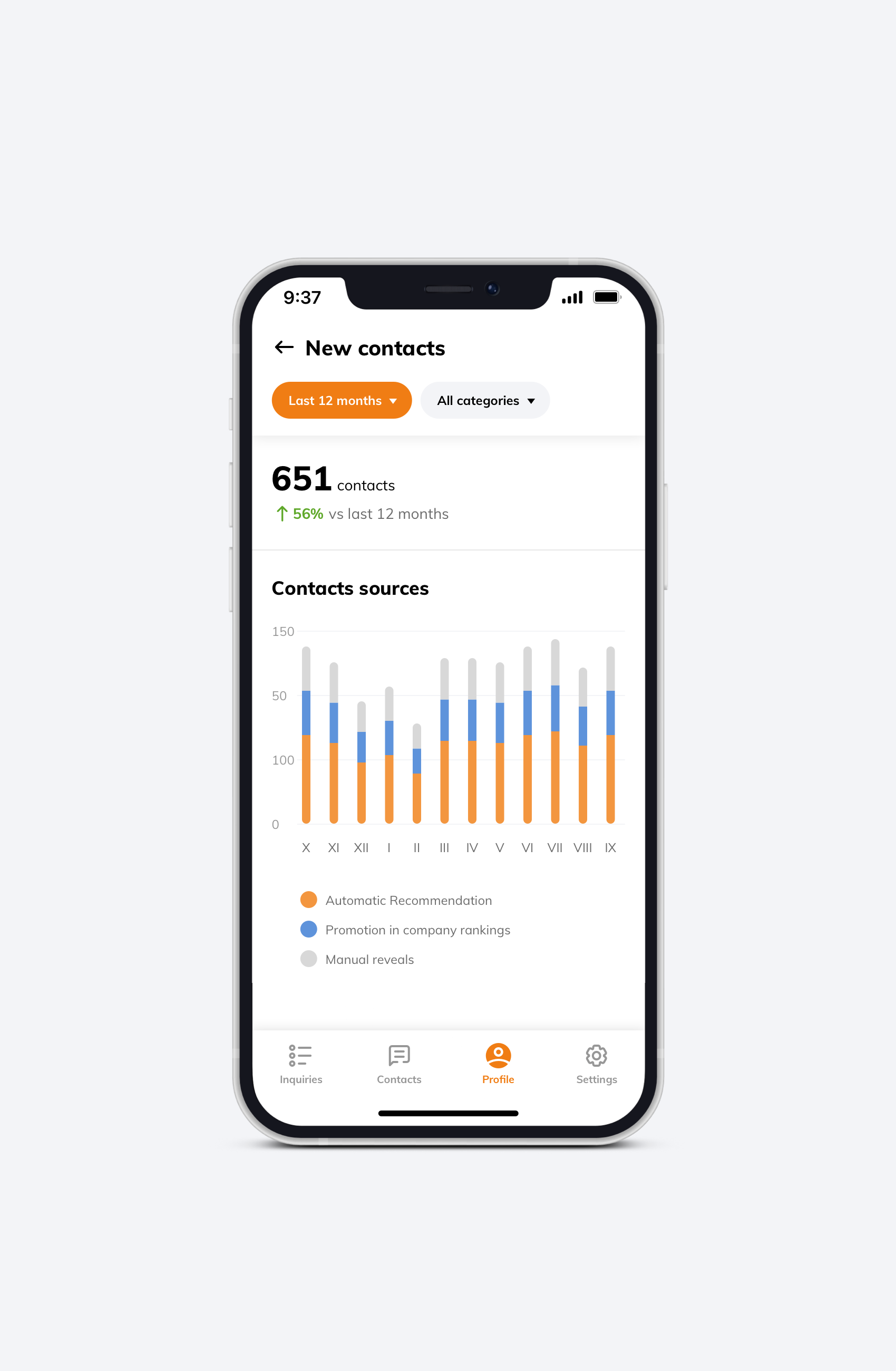
I designed an MVP "Statistics Centre" to make paid features easier to understand, evaluate, and manage in one place.
Some of Oferteo's paid features delivered clear value, but it wasn't always easy for businesses to see what they were getting back. The goal was to make performance and ongoing cost feel transparent, not abstract.
I structured the experience around the question users naturally ask when assessing effectiveness: "How many contacts do I get?" From there, the layout became a simple, focused set of views that cover the essentials without burying people in detail. The MVP was organized into three tabs, separating overall contacts from feature-specific performance, and it combined high-level trends with practical controls to start, adjust, or stop paid options.
To keep it intuitive at scale, tables and filters followed the platform's existing service-first mental model across locations, so the way users explored results matched how they set things up in the first place — a deliberate information architecture decision to reduce learning curve for an already familiar user base.




Outcome
Two years of embedded work: comparative benchmark testing validated a 47% faster checkout, an MVP transparency tool for businesses, and a design system kept consistent throughout.
Across two years working embedded with Oferteo's teams, these projects kept the platform's experience consistent while the product scaled and new needs emerged. The payment redesign was validated through usability testing measuring time-on-task before and after launch, and post-launch usage shifted noticeably toward BLIK — consistent with users gravitating toward the fastest, most familiar option once the external redirect was removed.
The Statistics Centre gave businesses a clearer, MVP-stage way to evaluate their paid features, both built on top of a design system I maintained throughout to keep the growing interface coherent.